StyledComponents(버튼) 알아보기 !
아무런 css 요소도 넣지 않은 버튼을 추가하면 그냥 회색의 밋밋한 버튼이 추가될것이다. 이걸 styled component 를 활용해서 꾸며보자.
import logo from './logo.svg';
import './App.css';
import StyledButton from './components/StyledButton';

function App() {
  return (
    <div className="App">
      <header className="App-header">
        <img src={logo} className="App-logo" alt="logo" />
        <p>
          <StyledButton>버튼</StyledButton>
          <StyledButton primary>버튼</StyledButton>
        </p>
      </header>
    </div>
  );
}

export default App;
위처럼 버튼을 두가지 생성했는데, 하나는 props 로 primary 를 줬다.
src 내부에 components 라는 폴더를생성하고 그 안에 StyledButton.jsx 로 컴포넌트를 생성한다.ㅍ
import styled, {css} from 'styled-components';

const StyledButton = styled.button`
  background: transparent;
  border-radius: 3px;
  border: 2px solid palevioletred;
  color: palevioletred;
  margin: 0 1em;
  padding 0.24em 1em;
  font-size: 20px;

  ${(props) => props.primary &&
  css `background: palevioletred;
  color: white;`
  }
`;// props 를 전달받아서 그 props 로 무언가를 표현한다.

export default StyledButton;
jsx 파일 내부에서도 위처럼 style 을 지정할 수 있다.
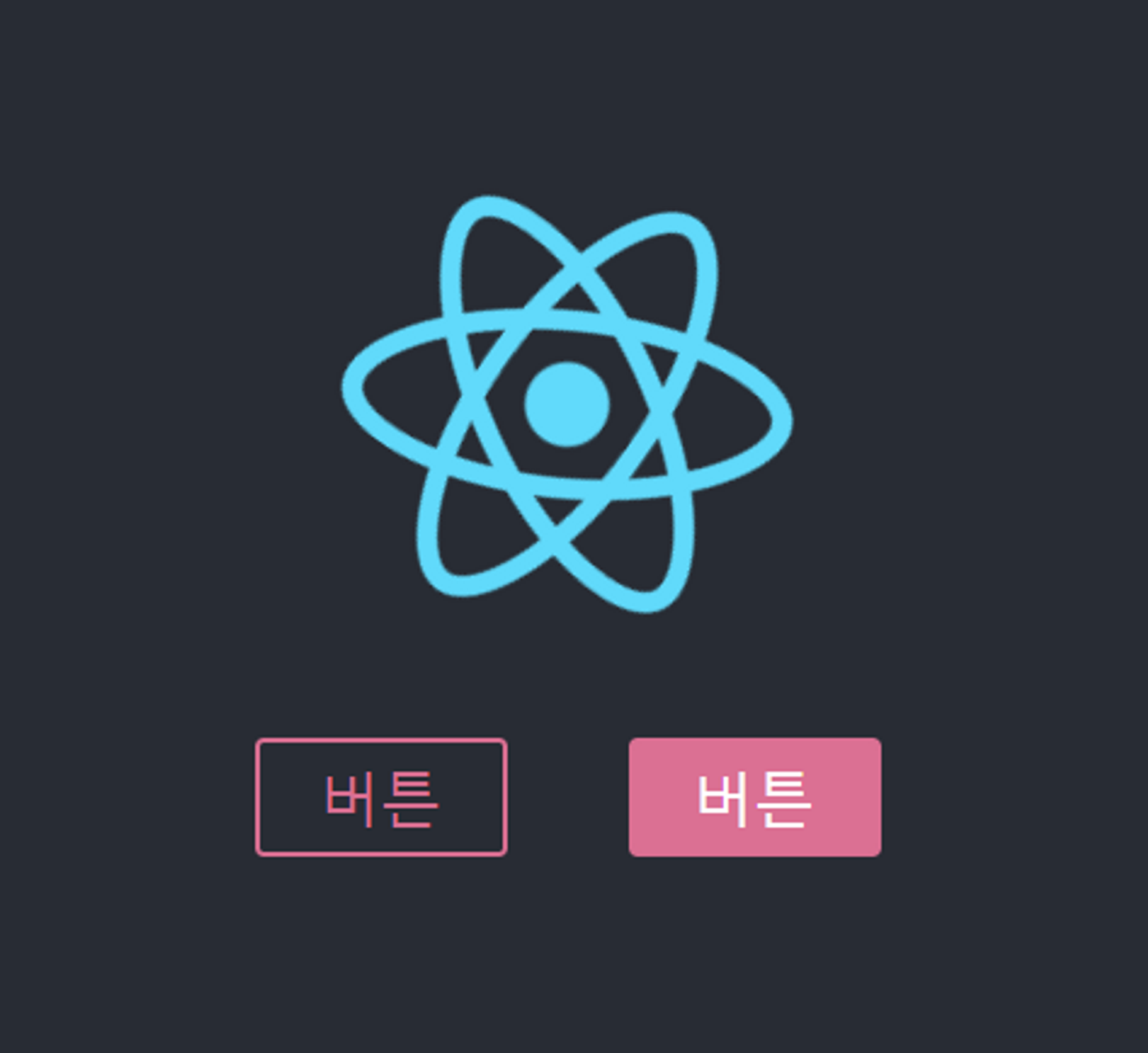
위까지 하면
이렇게 두가지 버튼이 생성된다.
몇가지 더 해볼건데,
const primaryStyledButton = styled(StyledButton)`
  background: palevioletred;
  color: white;
`;

function App() {
  return (
    <div className="App">
      <header className="App-header">
        <img src={logo} className="App-logo" alt="logo" />
        <p>
          <StyledButton>버튼</StyledButton>
          <StyledButton primary>버튼</StyledButton>
          <primaryStyledButton>버튼</primaryStyledButton>
          <StyledButton as="a" href="/">버튼</StyledButton>
        </p>
      </header>
    </div>
  );
}
이렇게 두 버튼을 추가하고 버튼 하나는 상단에 스타일을 만들어주고, 하나는 as를 활용해서 href 태그처럼 사용한다.
as 는 컴포넌트로 지정할 수도 있다.
const UppercaseButton = (props) => <button {...props}
children={props.children.toUpperCase()}/>;
이렇게 대문자로 바꿔주는 컴포넌트를 작성하고
<StyledButton as={UppercaseButton}>button</StyledButton>
이렇게 사용하면 된다.
const MyButton = (props) => (
  <button className={props.className} children={`MyButton ${props.children}`} />
);

StyledMyButton>버튼</StyledMyButton>
또, 이렇게 props 로 받아와서 스타일을 지정해줄수도있다.
조건부 처리
const StyledMyButton = styled(MyButton)`
 background: transparent;
  border-radius: 3px;
  border: 2px solid ${(props) => props.color || "palevioletred"};
  color: ${(props) => props.color || "palevioletred"};
  margin: 0 1em;
  padding 0.24em 1em;
  font-size: 20px;
`;

<StyledMyButton color="green">버튼</StyledMyButt
기존의 코드에서 테두리색과 컬러를 저렇게 바꿔주고 Button 에서 인자로 color=”green” 으로 해주면
이렇게 조건부 변경이 가능하다.
const StyledMyButton = styled(MyButton)`
 background: transparent;
  border-radius: 3px;
  border: 2px solid ${(props) => props.color || "palevioletred"};
  color: ${(props) => props.color || "palevioletred"};
  margin: 0 1em;
  padding 0.24em 1em;
  font-size: 20px;

  :hover {
    border: 2px solid red;
  }

  :: before {
    content: "@";
  }
`;
ㅇ이외에도 hover 나 before 옵션을 활용하여 꾸며줄 수 있다.
styled component 문서를 좀 더 찾아보자.
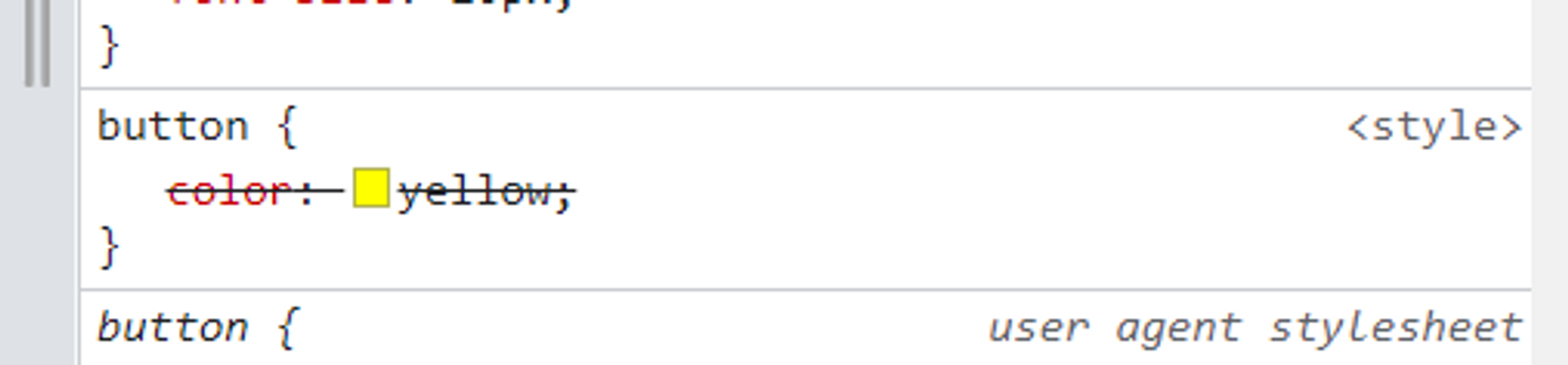
이건 전역적으로 설정하는것엔 어려움이 있다.
const GlobalStyle = createGlobalStyle`
button {
  color: yellow;
}
`;
그렇기에 이런식으로 따로 전역적으로 설정해주어야한다.
하지만, 이미 다른 컴포넌트들로 color 를 지정해주었기에 위 속성은 화면에 보이진 않는다.
default 속성 지정해주기
만약 우리가 구글 홈페이지를 링크로 그냥 걸면 해당 페이지 자체가 구글홈페이지로 변하는게 기본일것이다. 새창에서 열리게 하려면 target=’_BLANK’ 를 사용하면 된다. 이 target 을 매번 선언해주기 싫을때 사용할 수 있는 기능이다.
태그
import styled from "styled-components";

const StyledA = styled.a.attrs(props => ({
  target: '_BLANK'
}))`
  color : ${(props) => props.color};
`;

export default StyledA;
attrs() 를 활용하여 target 을 기본속성으로 세팅해줬다. 이렇게 하면 App.js에서 target 을 적지 않아도 된다.
import logo from './logo.svg';
import './App.css';
import StyledButton from './components/StyledButton';

function App() {
  return (
    <div className="App">
      <header className="App-header">
        <img src={logo} className="App-logo" alt="logo" />
        <p>
          <StyledButton>버튼</StyledButton>
          <StyledButton primary>버튼</StyledButton>
        </p>
      </header>
    </div>
  );
}

export default App;
위처럼 버튼을 두가지 생성했는데, 하나는 props 로 primary 를 줬다.
src 내부에 components 라는 폴더를생성하고 그 안에 StyledButton.jsx 로 컴포넌트를 생성한다.ㅍ
import styled, {css} from 'styled-components';

const StyledButton = styled.button`
  background: transparent;
  border-radius: 3px;
  border: 2px solid palevioletred;
  color: palevioletred;
  margin: 0 1em;
  padding 0.24em 1em;
  font-size: 20px;

  ${(props) => props.primary &&
  css `background: palevioletred;
  color: white;`
  }
`;// props 를 전달받아서 그 props 로 무언가를 표현한다.

export default StyledButton;
jsx 파일 내부에서도 위처럼 style 을 지정할 수 있다.
위까지 하면
이렇게 두가지 버튼이 생성된다.
몇가지 더 해볼건데,
const primaryStyledButton = styled(StyledButton)`
  background: palevioletred;
  color: white;
`;

function App() {
  return (
    <div className="App">
      <header className="App-header">
        <img src={logo} className="App-logo" alt="logo" />
        <p>
          <StyledButton>버튼</StyledButton>
          <StyledButton primary>버튼</StyledButton>
          <primaryStyledButton>버튼</primaryStyledButton>
          <StyledButton as="a" href="/">버튼</StyledButton>
        </p>
      </header>
    </div>
  );
}
이렇게 두 버튼을 추가하고 버튼 하나는 상단에 스타일을 만들어주고, 하나는 as를 활용해서 href 태그처럼 사용한다.
as 는 컴포넌트로 지정할 수도 있다.
const UppercaseButton = (props) => <button {...props}
children={props.children.toUpperCase()}/>;
이렇게 대문자로 바꿔주는 컴포넌트를 작성하고
<StyledButton as={UppercaseButton}>button</StyledButton>
이렇게 사용하면 된다.
const MyButton = (props) => (
  <button className={props.className} children={`MyButton ${props.children}`} />
);

StyledMyButton>버튼</StyledMyButton>
또, 이렇게 props 로 받아와서 스타일을 지정해줄수도있다.
조건부 처리
const StyledMyButton = styled(MyButton)`
 background: transparent;
  border-radius: 3px;
  border: 2px solid ${(props) => props.color || "palevioletred"};
  color: ${(props) => props.color || "palevioletred"};
  margin: 0 1em;
  padding 0.24em 1em;
  font-size: 20px;
`;

<StyledMyButton color="green">버튼</StyledMyButt
기존의 코드에서 테두리색과 컬러를 저렇게 바꿔주고 Button 에서 인자로 color=”green” 으로 해주면
이렇게 조건부 변경이 가능하다.
const StyledMyButton = styled(MyButton)`
 background: transparent;
  border-radius: 3px;
  border: 2px solid ${(props) => props.color || "palevioletred"};
  color: ${(props) => props.color || "palevioletred"};
  margin: 0 1em;
  padding 0.24em 1em;
  font-size: 20px;

  :hover {
    border: 2px solid red;
  }

  :: before {
    content: "@";
  }
`;
이외에도 hover 나 before 옵션을 활용하여 꾸며줄 수 있다.
styled component 문서를 좀 더 찾아보자.
이건 전역적으로 설정하는것엔 어려움이 있다.
const GlobalStyle = createGlobalStyle`
button {
  color: yellow;
}
`;
그렇기에 이런식으로 따로 전역적으로 설정해주어야한다.
하지만, 이미 다른 컴포넌트들로 color 를 지정해주었기에 위 속성은 화면에 보이진 않는다.
default 속성 지정해주기
만약 우리가 구글 홈페이지를 링크로 그냥 걸면 해당 페이지 자체가 구글홈페이지로 변하는게 기본일것이다. 새창에서 열리게 하려면 target=’_BLANK’ 를 사용하면 된다. 이 target 을 매번 선언해주기 싫을때 사용할 수 있는 기능이다.
<StyledA href="https://google.com" target="_BLANK">태그</StyledA>import styled from "styled-components";
const StyledA = styled.a.attrs(props => ({
target: '_BLANK'
}))`
color : ${(props) => props.color};
`;
export default StyledA;
attrs() 를 활용하여 target 을 기본속성으로 세팅해줬다. 이렇게 하면 App.js에서 target 을 적지 않아도 된다.